Designing your website is a combination of both visual and functional factors. Add to that site speed and responsiveness requirements for the various smart phones, PCs, laptops and tablets through which people view your site, as well as Google ranking, Search Engine Optimisation and site security and it can start to be a bit challenging.
Great design principles and practices will not only ensure that your website looks good, no matter where it is viewed, it will be clear and legible and a nice place to be. Additionally, good design should take into consideration the customer’s journey once they are on your site and lead them to the actions that you want them to take.
There is not much joy in forcing them to your landing page, but leading them through the logical steps of further engaging with you will bring you better results.
Here’s 4 components you need to consider carefully for ensuring great design which is both functional, aesthetically pleasing and converts lookers to buyers, or at the very least an enquiry that you can sell.
1. Typography
Typography can make or break a site. Text which is too small, too light – in either colour or weight, too complicated can all make your site difficult to read. When choosing text colours, consider the contrast between text and background which should be sharp for easy recognition. Give some thought to the style of lettering – do you want all lowercase, capitalisation like a title with all the main words capitalise, or like a sentence with only the first word capitalised, or all in capitals for the whole sentence of paragraph?
More “white space” – that is the space which has nothing in it – makes reading online easier on the eye. Think about the text spacing and line height which will all impact the readability of your chosen font. Think carefully about how much space there is between your blocks of text and other elements on the page such images, icons or logos.
2. Type Hierarchy
The type hierarchy you choose also helps guide users through your site. Type hierarchy is a system for organising type that establishes an order of importance within the information on your site.
It helps your readers navigate through your site and isolate certain information based on the style of text you have used for headings and sub headings.
Without type hierarchy there would be no headings and the whole page would appear as monotype font which is hard to read and not very appealing to someone visiting your site. Headings and subheadings can add to the feel of your website – are they the same font, but bold, or the same font but a different c colour? Or are they a different font and a different colour to really stand out? What ever you choose, it should sit well with the look and feel of the rest of your site.
3. Colour
Colour can give your website a different feel, depending on what you choose. Perhaps you already have your brand colours sorted out so your website should be a reflection of those colours – you may need to use various shades of colour to complement your branding.
If you don’t already have branding colours in place, it is worth considering carefully the colours that you want on your website. Different colours convey different emotions and moods. A quick Google search will bring back all sorts of information about colour.
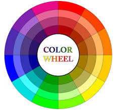
When I branded my business, I chose orange and blue very specifically. Orange is the colour of creativity and is considered friendly and cheerful – I like to think I am all of those things and that my business culture is too. Blue is the colour of dependability (and why the big banks tend to like it), trust and strength. Orange and blue are also pretty much opposite to each other on a colour wheel so they complement each other well.
4. Layout
Consider the layout as part of the overall design – does it make it obvious what the site is about when you first land there? Is it clear what the business does, what they want you to do and how you can go about engaging with them further?
Before starting a site design and build, I ask my clients to find other websites that they like and, if they can, to identify why they like about the site. Unless you’re working with websites all the time, there are probably some features that you won’t even notice, but you will have an instinct about whether you like it or not.
Have a look at the same website on another device – your laptop, smart phone or tablet. Does the site change according to which device you are viewing it on? This is called responsiveness and with over 60% of the web being viewed on a smart phone first it has become very important to the users’ experience. So important that recently Google added this consideration regarding site responsiveness when it is ranking your site.
If it doesn’t respond to your particular screen size, it can be a very unpleasant experience scrolling back and forth on your phone just to read the first couple of paragraphs before you get tired of that and move on – and let’s face it we’re pretty lazy and we will just move on to another site which is responsive.
Does the interaction between text and images help or hinder the business to get their message across? Are the images appropriate to the subject matter? Do they portray the type of business that the website is for?
There is plenty to consider when designing a new website – before you engage a web designer take time to have a look at what other people in your industry are doing. What do their websites look like, how do they function, where are the client interaction points (“calls to action”). Do you want to be like them or stand out from the crowd? Are you trying to attract the same people or different clients?
Each of these considerations will influence how your site is designed so make sure you discuss those things before you start and know what you want. Using great design principles, your site will not only look amazing, it will be functional and fast and take your visitor exactly where you want them to go whether that is to your online store, your enquiry form or your social media pages.
P.S.
Found a spelling or grammatical error in this post? Then contact me as soon as possible and let me know. In return for your super proof reading, I will offer you a free 30-minute review of your digital presence and some fresh ideas you can try out for free.
Get in Touch
If you’d like to discuss web design, you can book a free clarity session where I will walk you through a review of your current site and provide a review of its usability, design and functionality.